


Positioning
& Guidelines

Motion Design


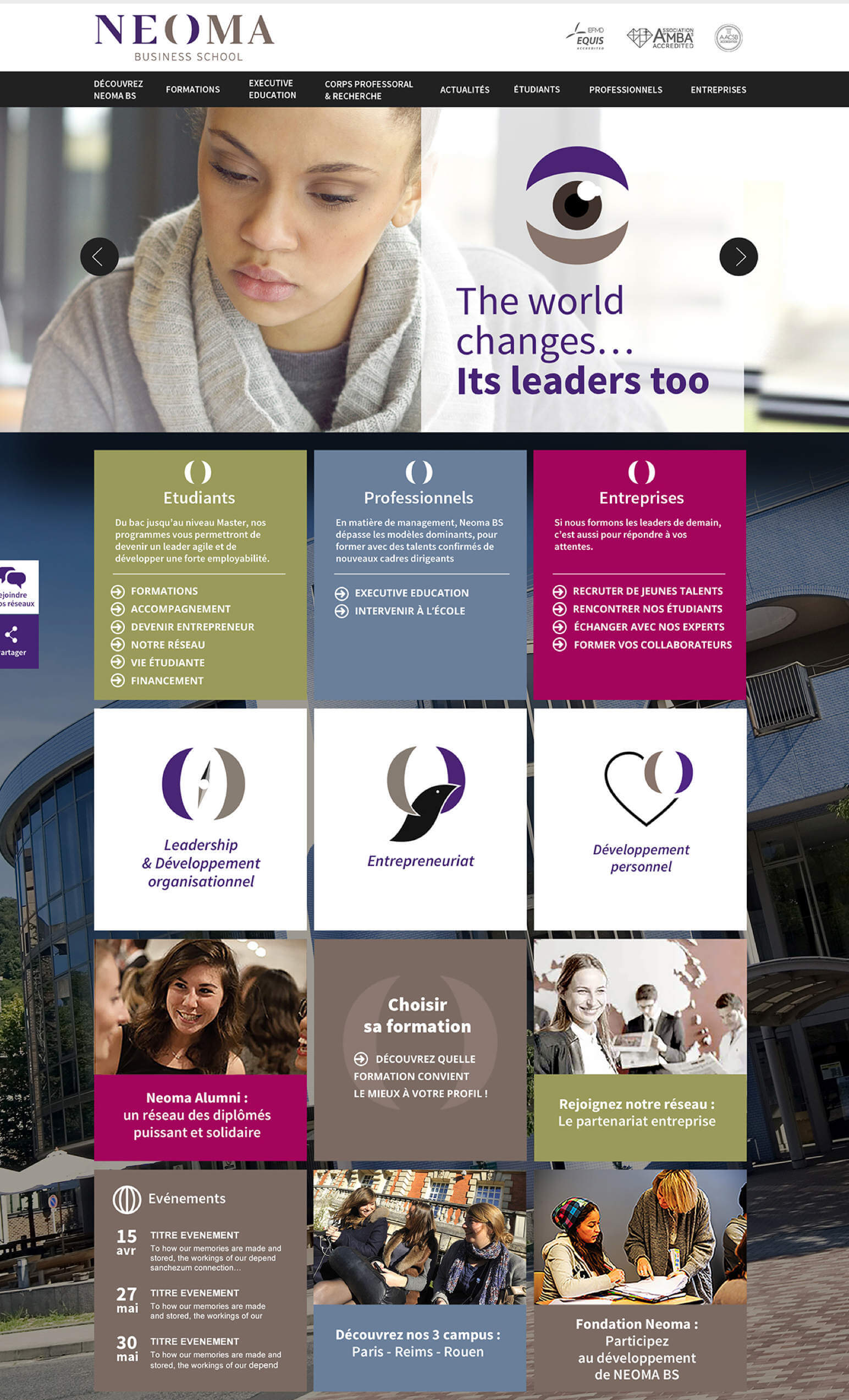
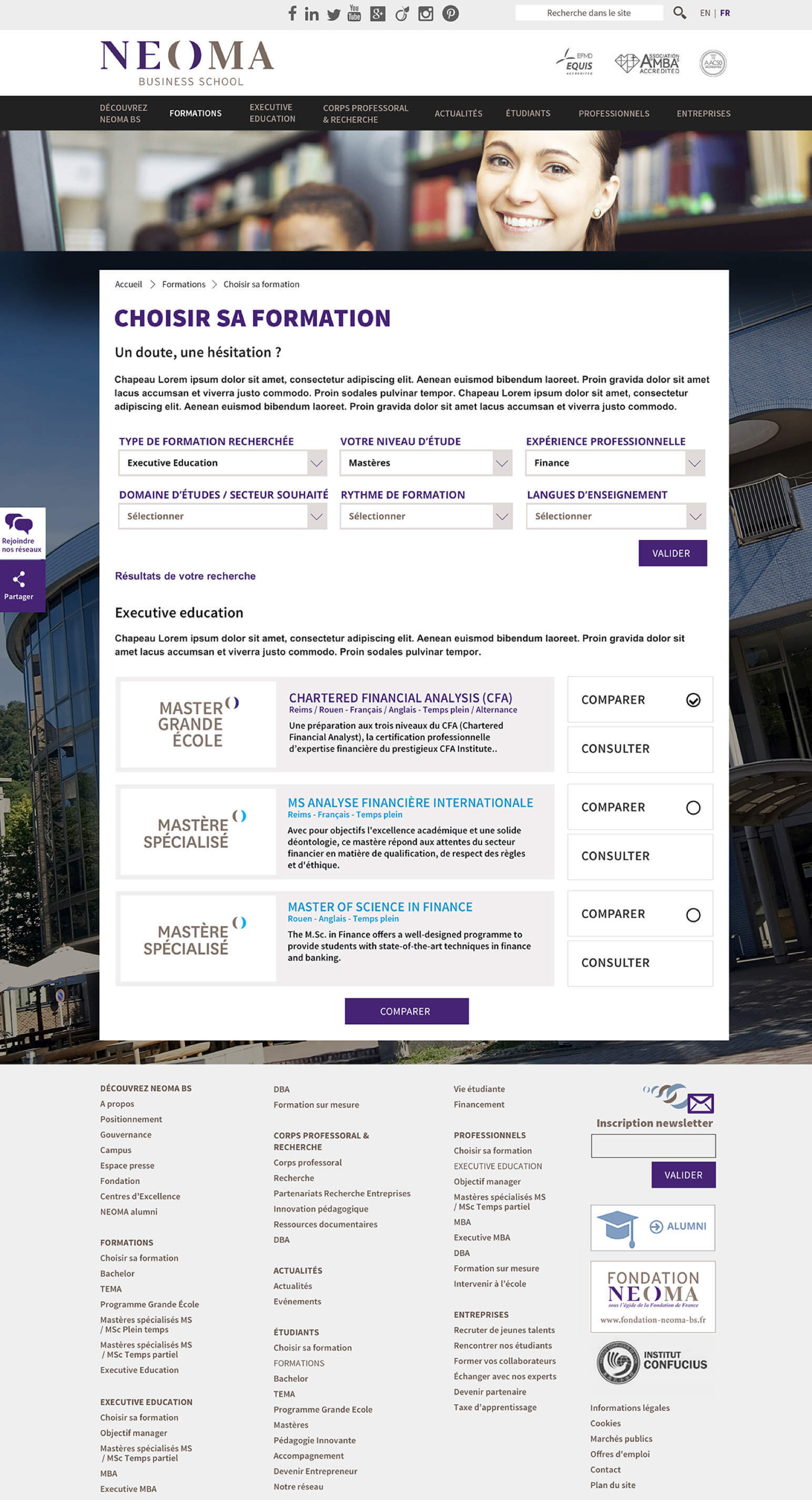
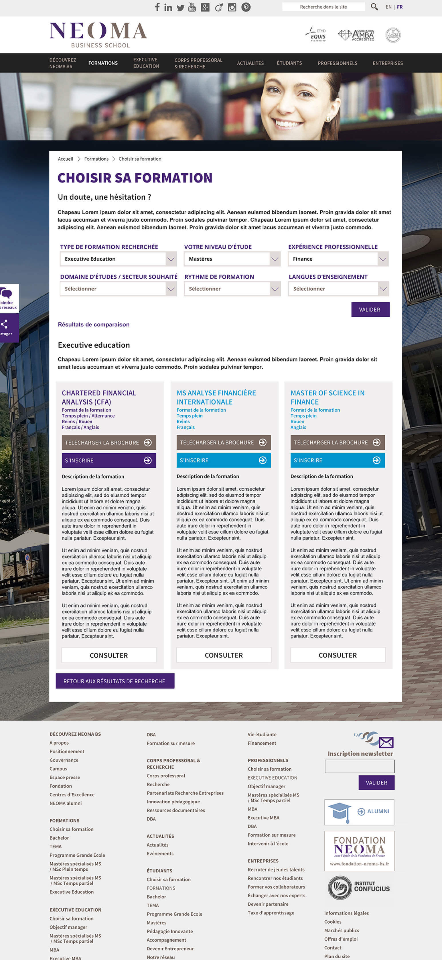
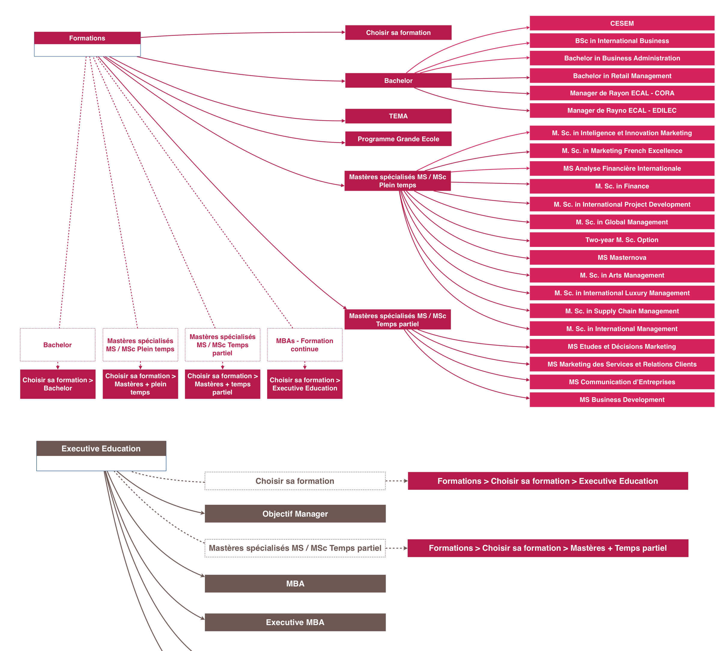
We collaborated with Neoma Business School to digitally transform their website, leveraging the latest technologies and enhancing the user experience. Through interviews and workshops with Neoma's incredible people, we reorganized the website's content and created models to showcase and amplify contributions from all parts of the institution. Our efforts resulted in a new digital experience with a streamlined structure, reflecting Neoma's innovative approach.

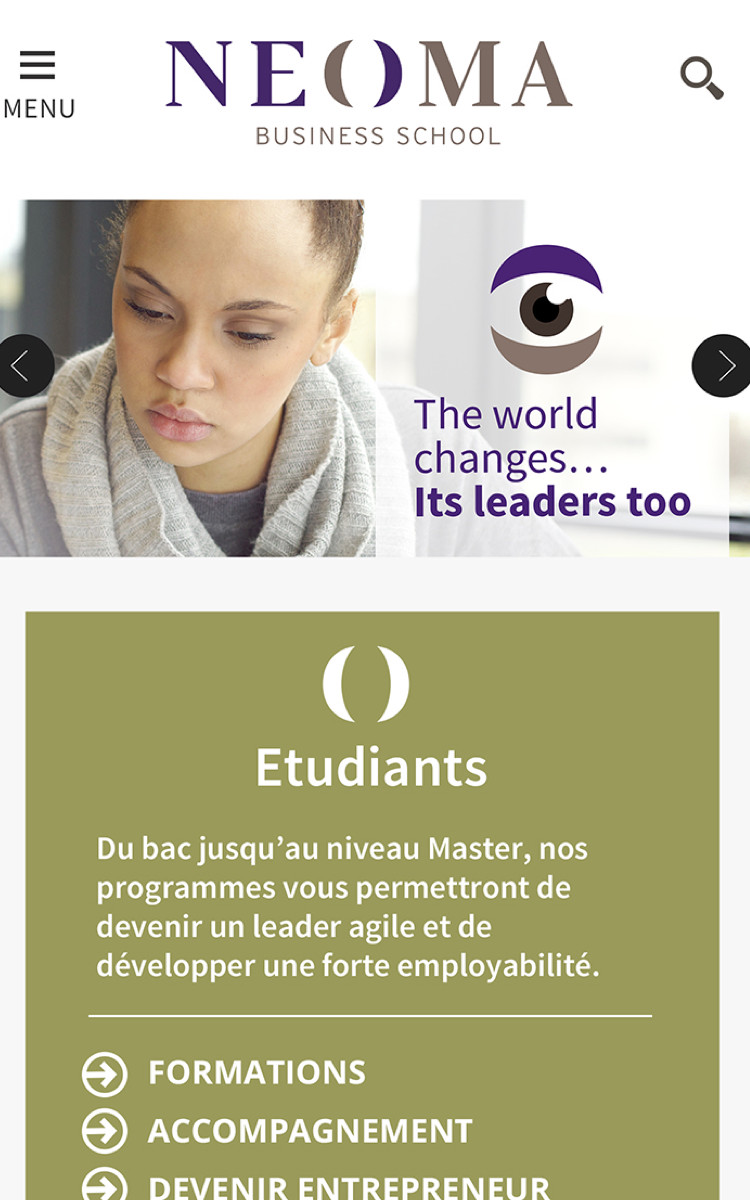

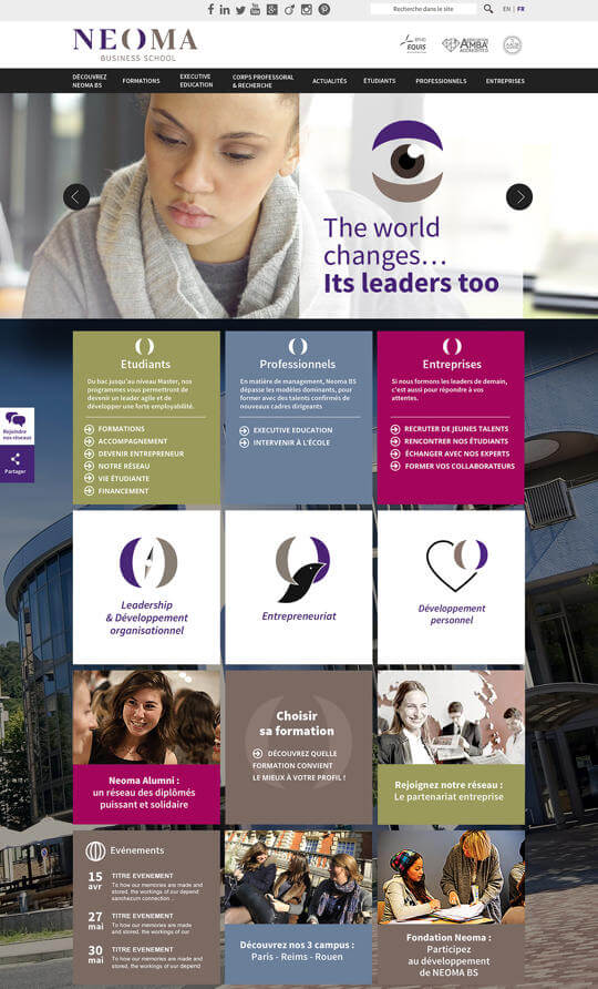
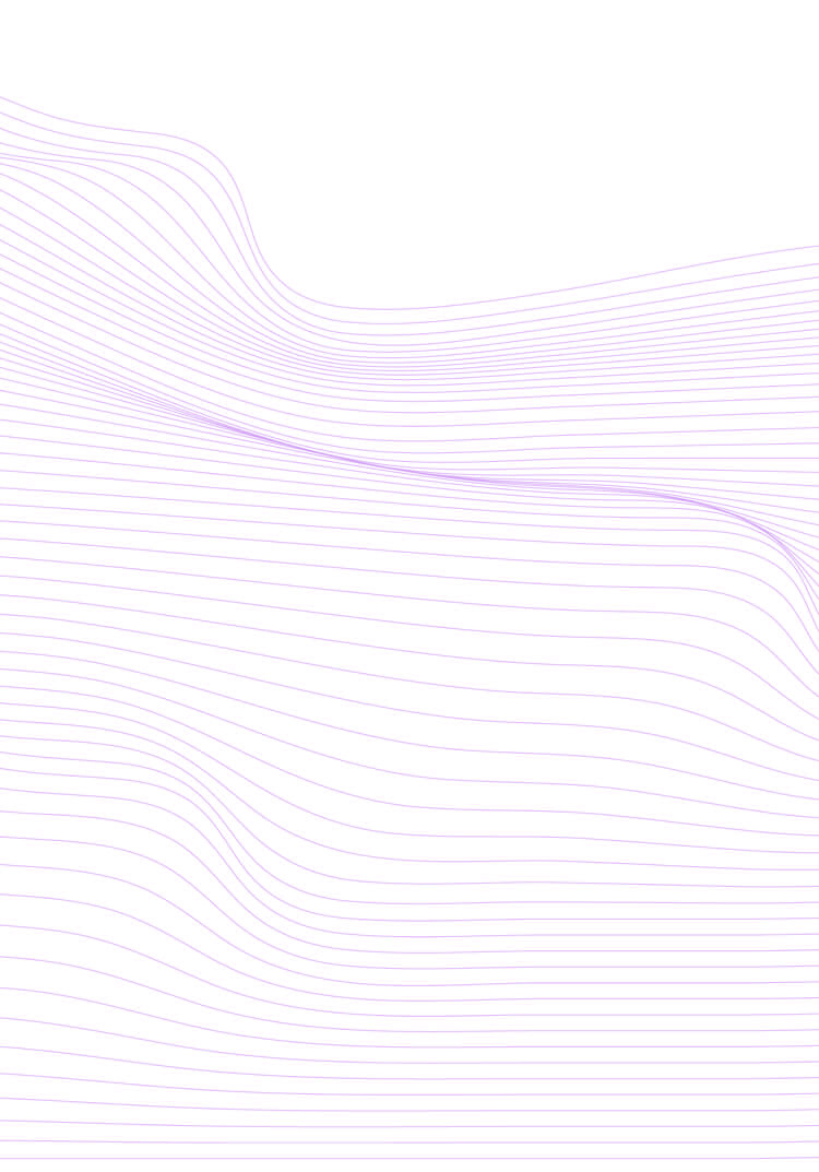
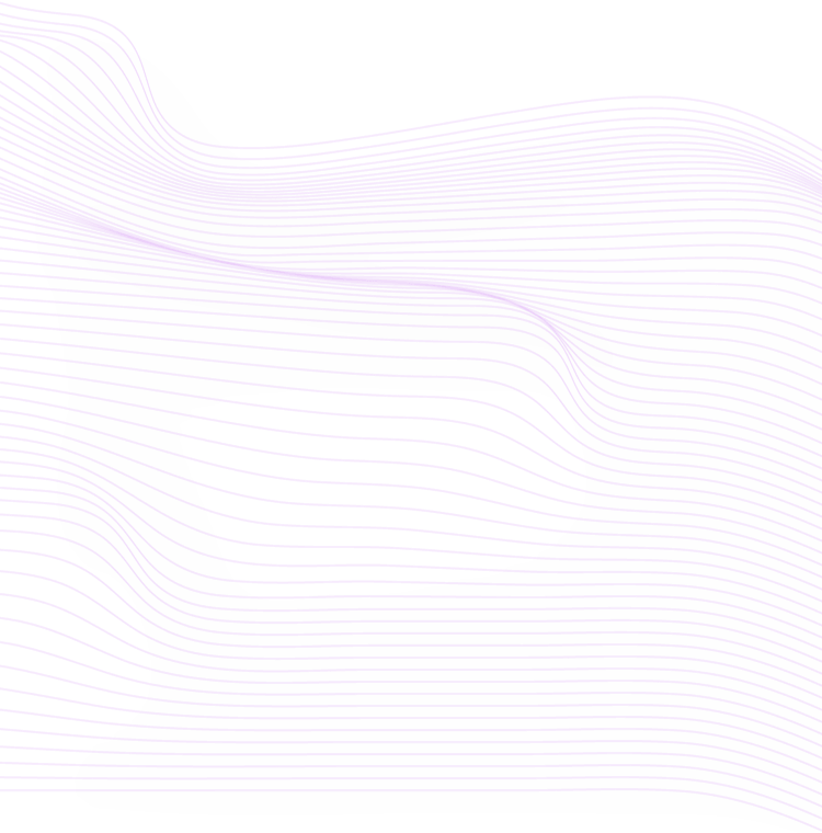
When developing Neoma Business School's new website, it was crucial to capture the essence of the institution's branding. The design had to reflect Neoma's experimental and creative nature, while also maintaining an authentic and welcoming feel. To achieve this, we opted for an "in-progress" aesthetic that showcased the beauty of the process through the use of grid lines. The content, much like the students, is free to break the rules when necessary, while motion and flux are depicted through undulating waves. The resulting design is both creative and innovative, while still remaining true to Neoma's branding.
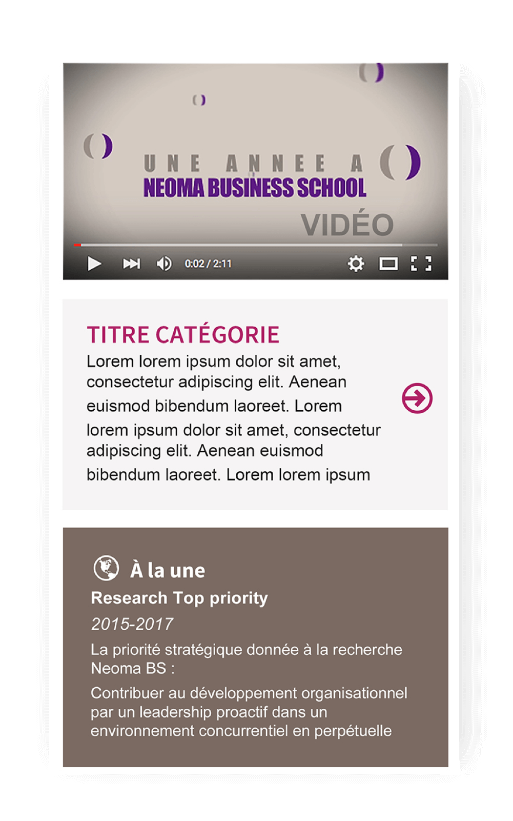

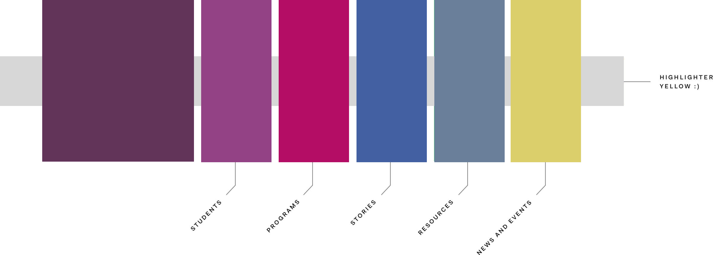
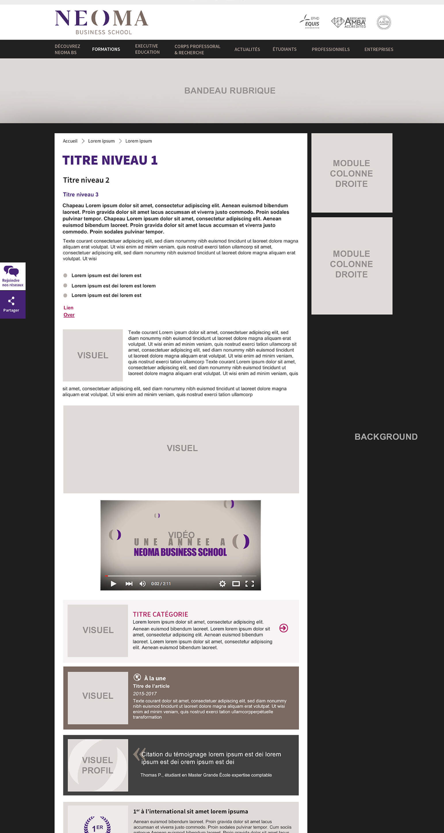
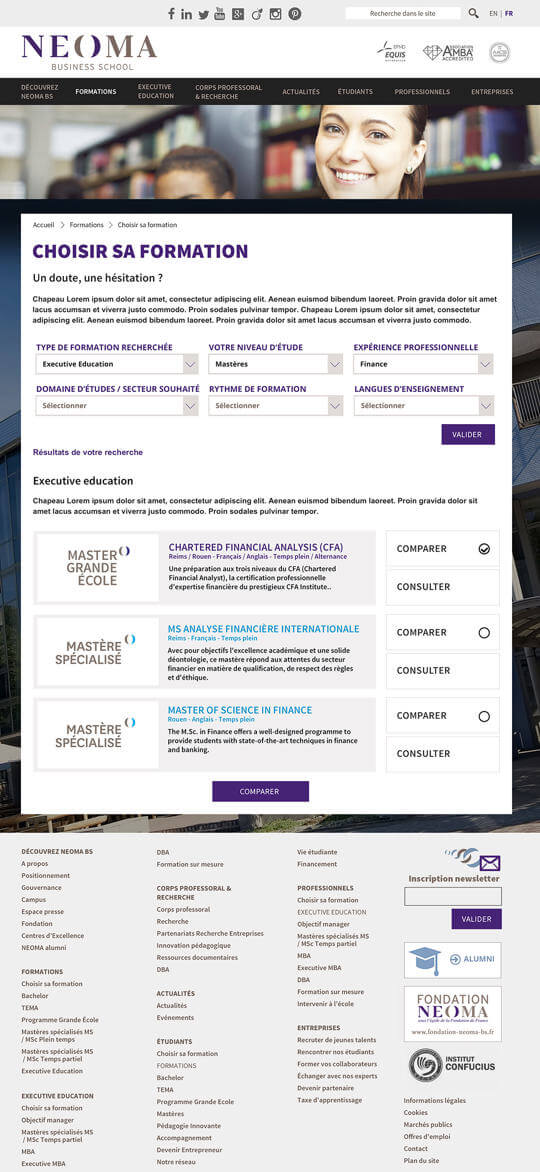
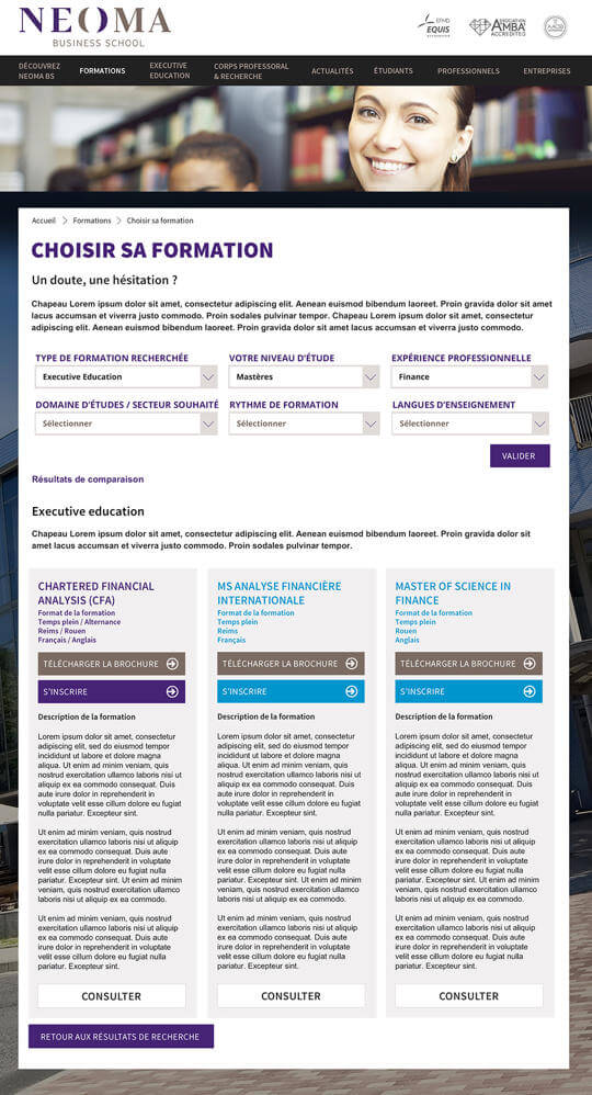
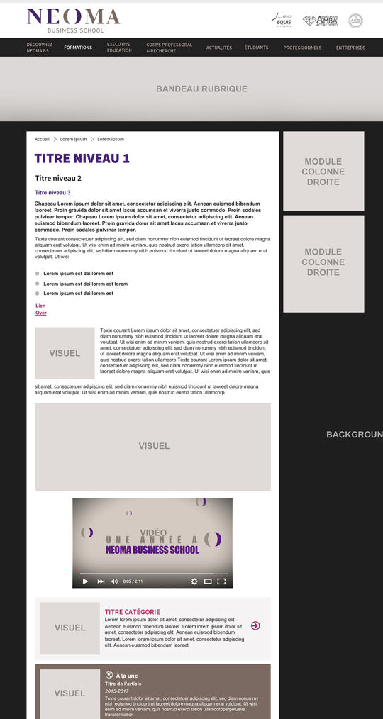
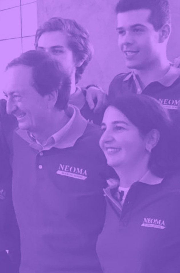
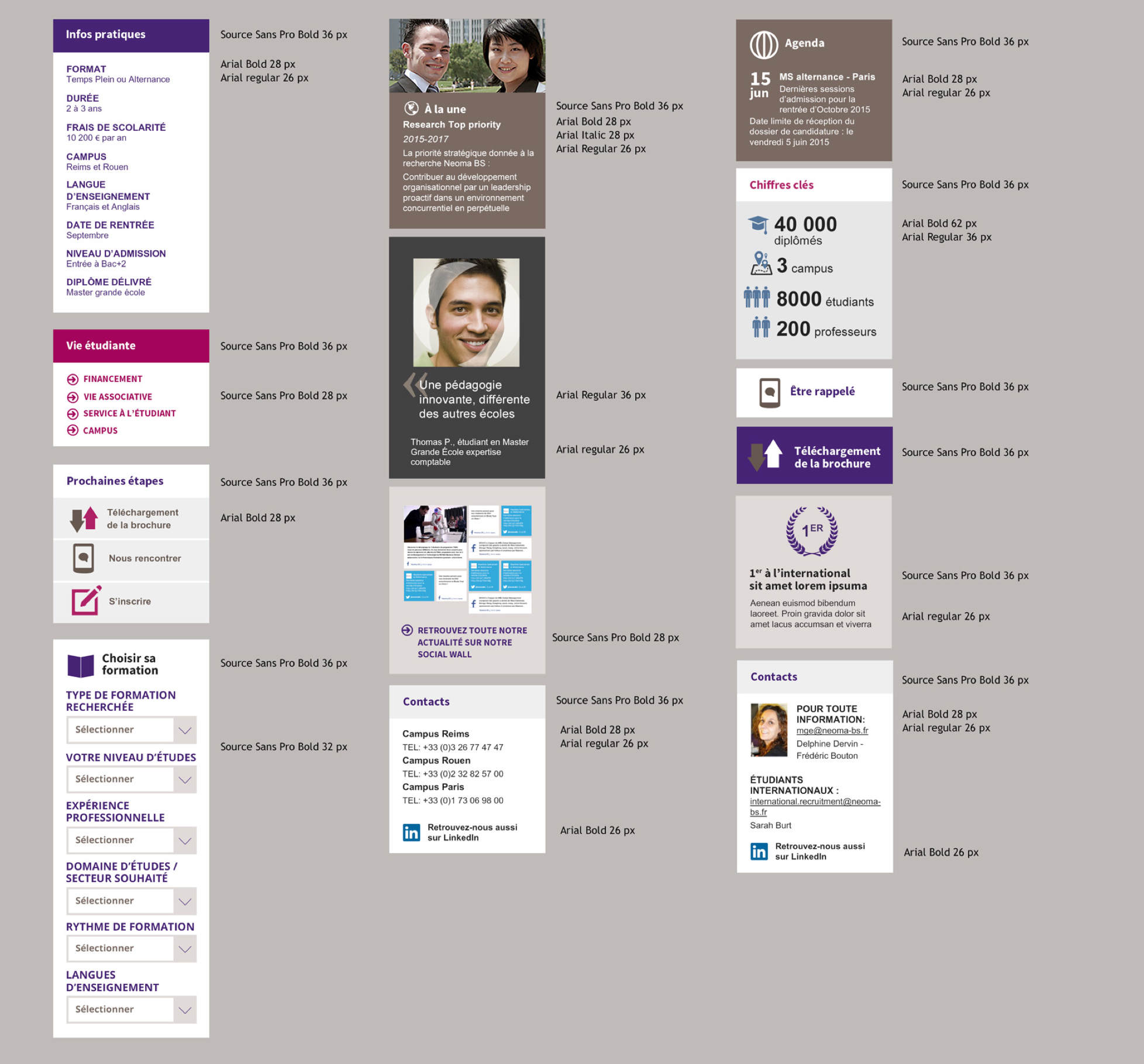
We relied on typography, color and grids to establish structure. The design incorporates white space to provide a sense of openness and different content structure to break any feeling of monotony. Color is used boldly, with layering and collage inspired by the univeristy space itself. Interactive elements add motion and movement.
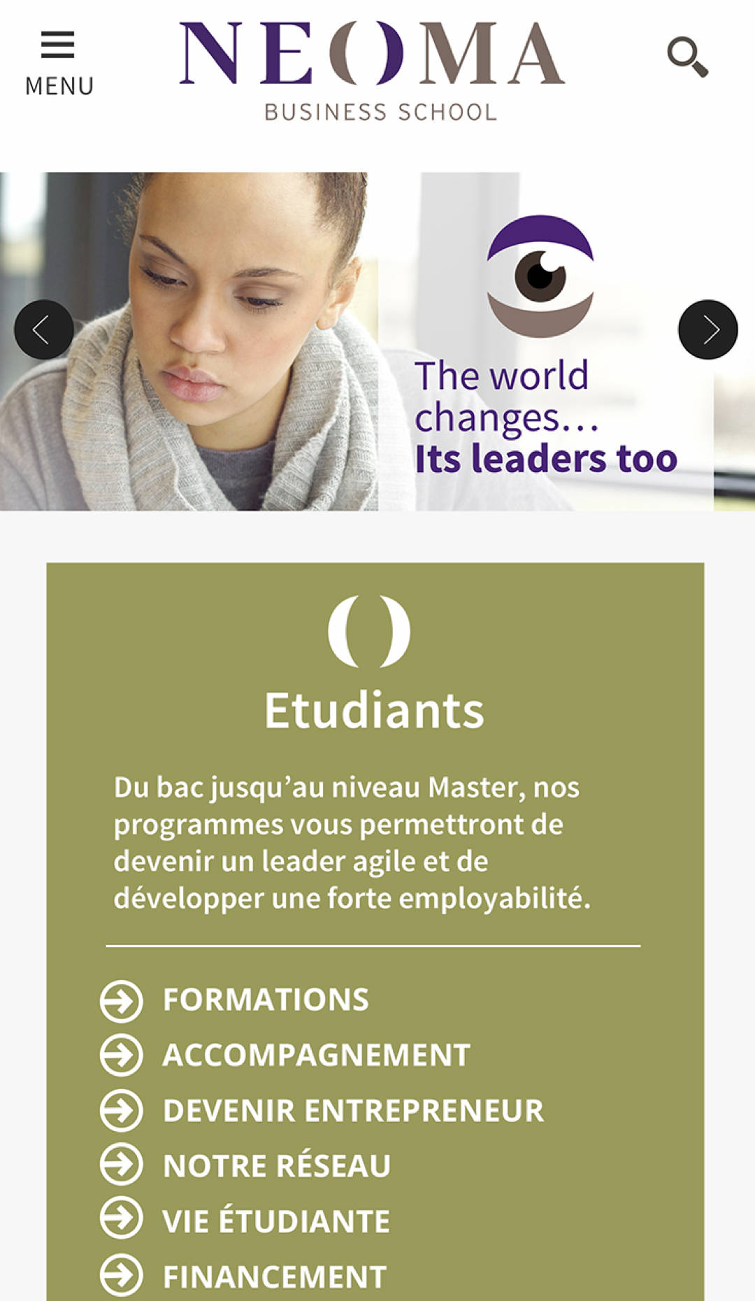
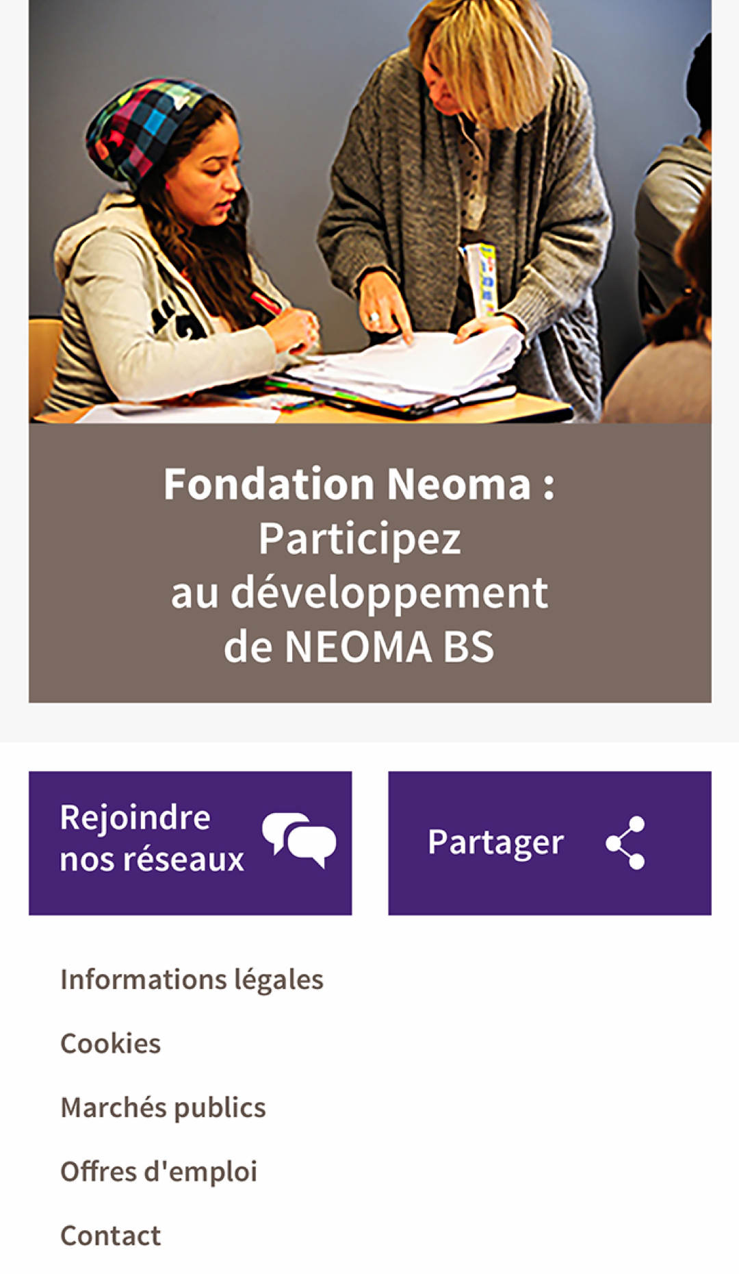


We approached the site with a series of principles: give people tools and minimize restrictions. Use design to provide structure and consistency, not constraints. Embrace the (constant) change. And finally, keep things modular to offer options for people adding to the site. We applied the visual aesthetic to these principles and used them as building blocks for a cohesive and beautiful website.