Why Your Website Needs to Be Mobile Responsive
In the rapidly evolving digital landscape, where user preferences and technological innovations dictate the rules, ensuring the relevance and effectiveness of your website is not merely a choice, it’s an imperative. The Mobile Revolution has fundamentally transformed the way users access information, and if your website fails to adapt to this seismic shift, you risk more than just aesthetic obsolescence.
In this comprehensive exploration, we will delve into the paramount importance of mobile responsiveness and why it stands as a linchpin for the success of your online presence.
The Mobile-First Paradigm
User Experience Redefined
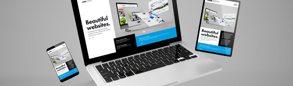
As the digital ecosystem becomes increasingly mobile-centric, prioritizing a responsive design takes center stage. A responsive website ensures that your content adjusts seamlessly to diverse screen sizes, offering an optimal user experience across devices, be it a smartphone, tablet, or desktop.
Google’s Embrace of Responsive Design
In the intricate realm of SEO, catering to the preferences of search engines is paramount. Google, the gatekeeper of online visibility, explicitly endorses responsive design. Websites that embrace this mobile-friendly approach often enjoy higher search rankings. Google acknowledges the importance of delivering content in a user-friendly manner across all devices, and responsive websites receive a nod of approval.
Responsive Design and SEO Synergy
Faster Loading Times
In the era of instant gratification, where every second counts, the need for speed is non-negotiable. Google, in its pursuit of delivering the best user experience, values fast-loading websites. Responsive designs inherently lead to quicker loading times, contributing positively to your site’s SEO performance.
Reduced Bounce Rates
Consider a user landing on your website only to be met with a clunky, non-responsive design. Frustration sets in, and the ‘back’ button becomes a tempting escape. Responsive design diminishes bounce rates, keeping visitors engaged and signaling to search engines that your content is not only relevant but valuable.
The Bottom Line: Business Impact
Wider Audience Reach
A responsive website is a versatile performer on the digital stage. It effortlessly caters to users across diverse devices, expanding your potential audience reach. In a world where first impressions matter, your website’s adaptability can be the key to unlocking new markets and connecting with a broader demographic.
Enhanced Conversion Rates
User experience directly influences conversion rates. A seamlessly responsive design guides users through your website intuitively, encouraging them to explore and, ultimately, convert. Whether it’s making a purchase, signing up for a newsletter, or any other desired action, a mobile-friendly design can significantly boost your conversion metrics.
Embrace Responsive Design: A Tactical Imperative
Competitive Edge in SERPs
Search Engine Results Pages (SERPs) are the battleground for digital supremacy. Your website’s position on these pages can make or break your online success. With Google’s emphasis on mobile-friendliness as a ranking factor, a responsive design becomes a strategic advantage. Outpace your competitors by ensuring your website not only meets but exceeds mobile responsiveness standards.
Future-Proof Your Online Presence
The digital landscape is ever-evolving, and trends in user behavior are dynamic. Investing in a responsive design isn’t just a current necessity; it’s a proactive measure to future-proof your online presence. As technology advances and new devices emerge, a responsive website adapts, ensuring your content remains accessible and appealing to users.
Elevate Your Website’s Potential
In the fiercely competitive digital arena, overlooking the significance of mobile responsiveness is a perilous oversight. Your website isn’t merely an online presence; it’s a dynamic entity that must evolve with user expectations and technological advancements.
Embrace responsive design not just as a checkbox in your web development process but as a strategic imperative that can propel your website to new heights of success.
Don’t let your website be a relic of the past. Embrace the mobile revolution, captivate your audience, and ascend the ranks of Google’s search results with a seamlessly responsive design. Your website’s destiny is in your hands – make it mobile-friendly, make it memorable.


Sorry, the comment form is closed at this time.