
Buttons are one of the most overlooked elements in digital design—but they hold enormous power. Every tap or click is a decision point for users, and the design of a button can influence action, perception, and trust.
From size and placement to color and micro-interactions, button design affects both usability and user psychology. Well-designed buttons guide users smoothly, increase engagement, and convey reliability, while poor design creates confusion and friction. This article explores how to craft buttons that inspire action and build trust.
The Psychology Behind Buttons
Buttons are more than visual cues—they communicate intent and reliability. Users rely on buttons to signal:
- Actionability: Is this element clickable or interactive?
- Importance: Is this the primary action or a secondary option?
- Feedback: What happens when I click it?
Cognitive load theory also plays a role: simple, predictable buttons reduce mental effort and make decisions faster, improving the likelihood of completing tasks.
Size, Shape, and Placement

Size
- Buttons must be large enough to tap comfortably on any device.
- On mobile, recommended minimum touch target: 44x44px.
- Oversized buttons can dominate the interface, while tiny ones can frustrate users.
Shape
- Rounded corners are often perceived as friendly and approachable.
- Rectangular buttons feel more formal and authoritative.
- Consistent shapes across the interface improve recognition.
Placement
- Place primary actions where users naturally look (e.g., bottom center on mobile).
- Secondary actions should be less prominent but still accessible.
- Maintain consistency in layout across pages to build predictability and trust.
Color and Contrast: Visual Signals of Trust
Color affects perception, urgency, and action. It communicates hierarchy and guides attention.
Button Color Tips
- Use contrasting colors against backgrounds for clarity.
- Primary actions should stand out; secondary actions can be muted.
- Consider cultural associations and accessibility (color blindness and contrast ratios).
Colors also influence emotional response. Green often signals progress or success, red can warn or deter, and blue conveys trust and reliability.
Copy and Microcopy: Words That Convert
The text inside the button (CTA) is as important as its visual design.
Best Practices
- Be action-oriented: “Sign Up Free” instead of “Submit.”
- Be concise: Keep it short for quick scanning.
- Clarify value: Let users know what happens after the click.
- Use urgency or reassurance when appropriate: “Get Your Guide Now” or “Try Risk-Free.”
Microcopy around the button—like tooltips, success messages, or error explanations—reinforces trust and clarity.
Micro-Interactions and Feedback
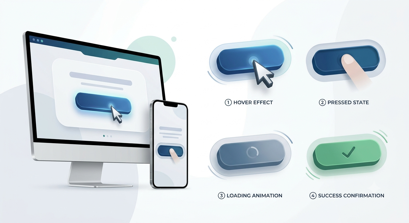
Buttons should respond to user interaction to confirm actions.
Key Micro-Interaction Elements
- Hover states: Provide feedback on desktop for clickable elements.
- Press states: Indicate a successful tap on mobile.
- Animations: Subtle animations can signal system response without distraction.
- Loading indicators: Prevent confusion when actions take time.
Immediate, predictable feedback reduces anxiety and builds confidence in the interface.
Consistency and Predictability
Predictable buttons increase user confidence:
- Use consistent colors, shapes, and placement throughout the interface.
- Standardize primary and secondary button hierarchy.
- Align design with users’ expectations based on common web and app patterns.
Consistency reduces cognitive load, making the interface feel reliable and trustworthy.
Testing Button Design for Optimal Performance
Even small design changes can significantly impact clicks and conversions. Testing ensures decisions are data-driven.
Testing Strategies
- A/B Testing: Compare different button colors, shapes, or copy.
- Heatmaps: See where users naturally focus their attention.
- User Feedback: Observe hesitation, misclicks, or confusion.
- Analytics: Monitor click-through rates, conversions, and task completion.
Iterative testing helps refine buttons to maximize action and trust.
Designing Buttons That Inspire Action
Buttons may be small, but they’re central to user flow and perception. Thoughtful design—considering size, shape, color, copy, feedback, and consistency—guides users confidently, reduces friction, and builds trust.
When buttons are clear, predictable, and responsive, users move forward seamlessly, completing tasks efficiently while feeling confident in the system. In digital design, the journey truly starts with a tap—and a well-designed button can make all the difference.