
In digital experiences, the smallest details can make a significant difference. A button that responds immediately, a form that provides helpful feedback, or a menu that opens smoothly may seem like minor design decisions. However, these subtle moments, known as micro-interactions, can shape how users perceive a website, navigate its content, and decide whether to take action.
As businesses invest in digital transformation, creating a visually attractive website is no longer enough. Brands must also deliver experiences that feel intuitive, responsive, and effortless. Micro-interactions help bridge the gap between interface design and human behavior, making digital products easier and more satisfying to use.
What Are Micro-Interactions in Web Design?
Micro-interactions are small, purposeful interface responses that communicate feedback or guide users through a digital experience. They typically occur when someone performs an action, such as clicking a button, entering information, scrolling through a page, or submitting a form.
Common examples include:
- A button changing appearance when a user hovers over it.
- A loading indicator showing that a request is being processed.
- A form field displaying an error message when information is entered incorrectly.
- A shopping cart updating immediately after an item is added.
- A subtle animation confirming that a setting has been saved.
- A navigation menu expanding smoothly when selected.
Unlike large animations or decorative visual effects, micro-interactions serve a specific functional purpose. They help users understand what is happening, what has changed, and what they should do next.
When implemented thoughtfully, these details make a website feel more responsive and reduce uncertainty throughout the user journey.
Why Small Interactions Matter for User Experience
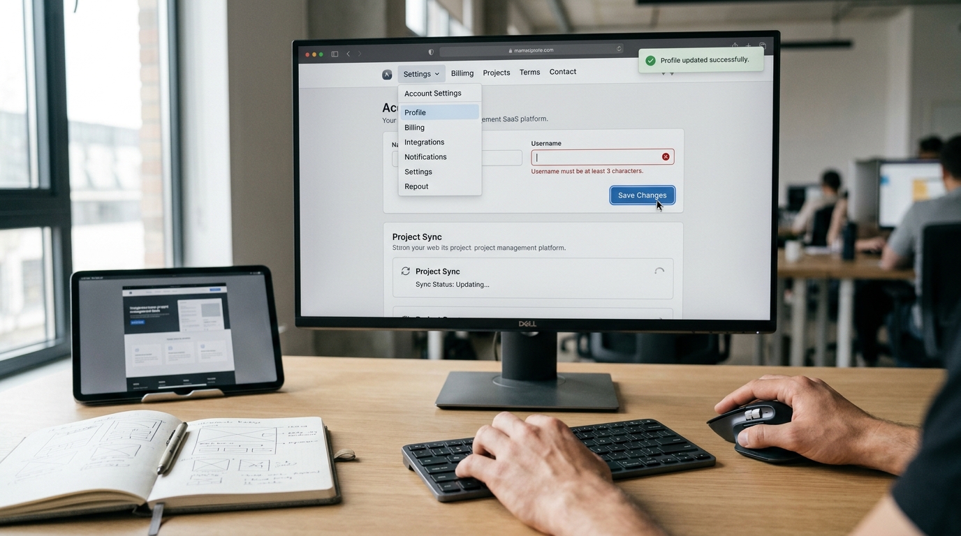
They Provide Immediate Feedback
One of the most frustrating digital experiences occurs when a user performs an action without receiving a clear response. If a button appears unresponsive or a form submission provides no confirmation, visitors may wonder whether the website is working correctly.
Micro-interactions resolve this uncertainty by providing immediate visual or functional feedback.
For example, when a visitor clicks a contact button, a clear state change can confirm that the action has been registered. If a request takes longer to process, a loading indicator can communicate that the system is working.
This feedback establishes a more predictable relationship between users and the interface. Instead of guessing what happened, visitors can proceed with confidence.
They Make Navigation More Intuitive
Website navigation should help users find information without requiring unnecessary effort. Micro-interactions can make navigation elements easier to understand by revealing available actions and responding consistently to user input.
A dropdown menu that opens smoothly, a clear active state in the navigation bar, or a back-to-top control that appears when needed can improve the overall browsing experience.
These details are particularly valuable for websites with multiple service categories, extensive content, or complex product structures.
The objective is not to animate every element. It is to use interaction patterns that clarify the interface and help visitors move naturally from one section to another.
They Reduce Errors and Friction
Small usability problems can interrupt the customer journey and discourage users from completing important actions.
Consider an enquiry form with several required fields. If visitors only discover missing information after submitting the entire form, they may need to repeat steps or search for the source of the error.
Inline validation can identify issues as users complete each field. Clear messages explain what needs to be corrected, while appropriate visual indicators help users locate the problem quickly.
The same principle applies to password requirements, appointment booking, checkout processes, and account registration.
By addressing problems at the moment they occur, micro-interactions reduce unnecessary friction and make digital tasks easier to complete.
How Micro-Interactions Support Conversion Optimization
A successful website must do more than attract visitors. It should guide them toward meaningful actions, including submitting enquiries, booking appointments, requesting quotations, or purchasing products.
Micro-interactions can support these goals by making conversion paths clearer and more reassuring.
Creating More Effective Calls to Action
Calls to action, commonly known as CTAs, direct users toward the next step in their journey. A well-designed CTA should be visually prominent, clearly worded, and easy to interact with.
A subtle hover effect or a change in button state can reinforce that an element is interactive. After a click, a loading state or confirmation message can indicate that the action has been received.
These responses help establish continuity between the user's intention and the website's behavior.
However, interaction design cannot compensate for an unclear offer or confusing messaging. The CTA must still communicate a meaningful benefit and provide an obvious next step.
Making Forms Easier to Complete
Forms are often critical conversion points, particularly for professional services, B2B businesses, and digital agencies.
Useful micro-interactions can improve the experience through:
- Real-time validation for required fields.
- Clear instructions for invalid email addresses or missing information.
- Progress indicators for multi-step forms.
- Visible focus states that show which field is currently active.
- Confirmation messages after successful submission.
For longer forms, progress indicators can help users understand how much work remains. For shorter forms, clear labels and immediate feedback may be more effective than adding unnecessary steps or animations.
The best solution depends on the form's complexity and the information the business needs to collect.
Building Confidence During Transactions
For e-commerce websites, trust is essential throughout the purchasing process.
When a customer adds an item to a cart, changes a product quantity, or completes a payment, the interface should communicate the result clearly. Without feedback, users may repeat an action, abandon the process, or become uncertain about whether their order was successful.
Micro-interactions can confirm changes, communicate processing states, and provide clear order confirmations.
These details do not independently guarantee more sales, but they can remove avoidable sources of confusion from the purchase journey.
Micro-Interactions and Brand Identity
Digital interactions also influence how users perceive a brand.
A luxury brand may use restrained transitions, refined motion, and carefully timed visual feedback to communicate sophistication. A technology company may prioritize speed, clarity, and functional precision. A playful consumer brand might use more expressive animations to reinforce its personality.
Consistency is essential. Buttons, menus, forms, notifications, and other interactive components should follow a coherent visual language.
When interaction patterns are inconsistent, the experience can feel fragmented. When they are designed as part of a broader brand system, even small interface responses can reinforce recognition and create a more cohesive digital identity.
For businesses investing in professional web design, this means interaction design should be considered alongside typography, color, layout, content, and visual hierarchy.
The Role of Micro-Interactions in Mobile-First Design
Mobile users interact with websites differently from desktop users. Smaller screens, touch-based navigation, variable network conditions, and limited screen space create distinct usability challenges.
Micro-interactions can help address these challenges when designed specifically for mobile environments.
For example, a touch-responsive button should provide clear feedback without relying on hover behavior. Expandable sections can reveal information without overwhelming the screen, while loading indicators can reassure users when a connection is slow.
Mobile forms also benefit from clear validation and visible confirmation messages, especially when users enter information using an on-screen keyboard.
Performance is equally important. Excessive animation can make a website feel slow, consume additional resources, or distract from the primary task.
Designers should prioritize lightweight effects, responsive layouts, touch-friendly controls, and support for reduced-motion preferences. Every interaction should improve usability rather than introduce another obstacle.
Accessibility: Making Interactions Work for Everyone

Effective micro-interactions should be accessible to people with different abilities and ways of navigating the web.
Relying exclusively on color to communicate an error, for instance, may make the message difficult to interpret for some users. Similarly, an animated element that cannot be controlled may create discomfort for people who prefer reduced motion.
Accessible interaction design should include:
- Visible keyboard focus indicators.
- Clear text labels and instructions.
- Feedback that does not rely solely on color or animation.
- Keyboard-accessible menus and interactive controls.
- Appropriate support for screen readers.
- Respect for operating-system reduced-motion preferences.
- Sufficient contrast and appropriately sized interactive targets.
Accessibility should be considered during the design and development process rather than added after the interface is complete.
A website that communicates clearly and supports different interaction methods can serve a broader audience while creating a more dependable experience for everyone.
Performance and Technical Considerations
Although micro-interactions can improve usability, poorly implemented effects can negatively affect website performance.
Large animation libraries, excessive JavaScript, unnecessary visual transitions, and repeated layout recalculations can increase page complexity. On slower devices, these issues may lead to delayed responses or distracting movement.
Developers should favor efficient implementation techniques and test interactions across different devices, browsers, and network conditions.
Where possible, simple transitions can be implemented with CSS rather than introducing additional JavaScript dependencies. Animations should avoid triggering unnecessary layout changes, and important content should remain accessible even if an effect fails to run.
Teams should also monitor relevant Core Web Vitals, including Largest Contentful Paint (LCP), Interaction to Next Paint (INP), and Cumulative Layout Shift (CLS). These metrics help assess loading performance, interaction responsiveness, and visual stability.
Micro-interactions should contribute to a smoother experience without compromising these broader performance objectives.
How to Measure the Effectiveness of Micro-Interactions
Not every animation or interaction produces measurable business value. Organizations should evaluate micro-interactions according to their purpose and the user behavior they are intended to support.
Useful measurement approaches include:
Conversion rate: Determine whether clearer interaction feedback helps more visitors complete important actions.
Form completion rate: Track the percentage of users who successfully submit an enquiry or registration form.
Form abandonment: Identify where users stop progressing through longer forms.
Task completion time: Evaluate how efficiently users complete specific activities, such as finding a service or requesting a quotation.
Interaction responsiveness: Monitor whether controls respond promptly and whether users experience delays.
Usability testing: Observe real users interacting with the website to identify confusion, hesitation, or unexpected behavior.
A/B testing can help compare alternative designs when sufficient traffic and a well-defined testing methodology are available. Changes should be evaluated against meaningful outcomes rather than visual preference alone.
It is also important to consider context. A longer session does not necessarily indicate a better experience, and a higher click rate does not always translate into more qualified leads. Measurement should reflect the website's actual business objectives.
A Practical Framework for Implementing Micro-Interactions
Businesses do not need to redesign an entire website to benefit from better interaction design. A structured approach can help teams identify improvements with the greatest potential value.
Step 1: Identify High-Impact User Journeys
Begin with the actions that matter most to the business, such as requesting a consultation, booking a service, purchasing a product, or contacting the sales team.
Review these journeys to identify points where users may experience uncertainty, delays, or unnecessary effort.
Step 2: Prioritize Functional Feedback
Address essential usability issues first. Ensure that buttons respond, forms explain errors, loading states communicate progress, and successful actions produce clear confirmation.
These improvements often have greater practical value than decorative animations.
Step 3: Establish Consistent Interaction Patterns
Define reusable behaviors for buttons, form fields, dropdowns, notifications, and other interface components.
A consistent design system makes the website easier to maintain and helps users understand how different elements behave.
Step 4: Test Accessibility and Performance
Check keyboard navigation, screen-reader compatibility, motion preferences, responsive behavior, and loading performance.
Testing should include real devices and realistic network conditions wherever possible.
Step 5: Measure and Refine
Use analytics, usability testing, and user feedback to determine whether the changes improve task completion and reduce friction.
Keep interactions that provide meaningful benefits, revise those that create confusion, and remove effects that add complexity without improving the experience.
The Future of Interaction Design
As digital experiences become more personalized and sophisticated, micro-interactions will continue to play an important role in making technology easier to understand.
AI-powered interfaces, conversational tools, and adaptive digital experiences introduce new opportunities for contextual feedback. For example, an interface may provide clearer guidance based on the information a user enters or communicate the status of an automated process in real time.
However, more intelligent interfaces do not necessarily require more animation. Clear language, predictable behavior, transparent feedback, and user control remain fundamental principles.
The most effective digital experiences will combine thoughtful interaction design with strong content, accessible development, and reliable performance.
Conclusion: Small Details, Better Digital Experiences
Micro-interactions demonstrate that effective web design extends beyond visual appearance. Every button response, validation message, navigation transition, and confirmation can influence how users understand and interact with a digital product.
When implemented strategically, these details can reduce uncertainty, improve usability, support accessibility, and make conversion journeys more straightforward.
For businesses, the opportunity lies in identifying the moments that matter most to customers and improving them with purposeful design rather than unnecessary effects.
At Pimclick, digital experiences bring together creativity, technology, and user-focused strategy. By combining thoughtful interface design with responsive development and conversion-focused thinking, businesses can create websites that not only look professional but also help users accomplish their goals.
A better digital experience is often built one thoughtful interaction at a time.