
With mobile devices accounting for the majority of internet traffic, having a mobile-friendly website is no longer optional—it’s essential. However, “mobile-friendly” can mean different things depending on your design approach. Two dominant strategies—responsive design and adaptive design—offer distinct advantages and trade-offs.
Choosing the right strategy impacts user experience, performance, and engagement. This article explains the differences, benefits, and considerations for selecting a mobile design approach that aligns with your goals.
What is Responsive Design?
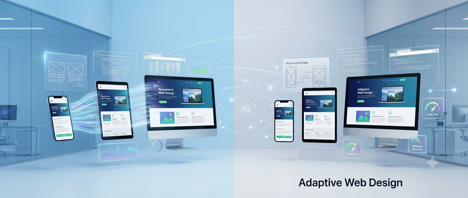
Responsive design uses flexible grids, images, and CSS media queries to automatically adjust a website’s layout to fit any screen size. The same HTML is delivered across devices, with the layout dynamically adapting.
Key Characteristics
- Single URL and single codebase
- Fluid layouts that adjust to screen width
- Consistent experience across devices
- Relatively easy to maintain once implemented
Benefits
- Easier long-term maintenance due to one version of the site
- SEO-friendly because search engines only index one URL
- Smooth experience across a wide range of devices, from phones to desktops
Considerations
- May load unnecessary elements on smaller screens
- Complex layouts can be challenging to scale fluidly
- Performance may suffer if not optimized for mobile
What is Adaptive Design?

Adaptive design detects a user’s device and delivers a predefined layout optimized for that specific screen size. Multiple layouts exist for different devices, typically using breakpoints.
Key Characteristics
- Device-specific templates
- Multiple versions of a page (mobile, tablet, desktop)
- Layout and content tailored to device capabilities
Benefits
- Optimized performance for each device
- Better control over design elements and user experience
- Can prioritize content differently for mobile vs. desktop
Considerations
- More complex to maintain because of multiple layouts
- Can increase development and testing costs
- May require redirects or additional technical configuration for SEO
Comparing Responsive and Adaptive Design
Factors to Consider When Choosing a Strategy
Audience Device Diversity
- Responsive design works well if your audience uses a wide range of devices with varying screen sizes.
- Adaptive design is ideal if most traffic comes from a few known devices, allowing for tailored experiences.
Performance Requirements
- If speed and efficiency are critical, adaptive design can deliver lightweight, device-specific assets.
- Responsive design requires careful optimization to avoid loading unnecessary resources.
Content Prioritization
- Adaptive design allows content to be reordered or prioritized for mobile users.
- Responsive design maintains consistent content flow but can require creative CSS to adapt layout.
Development and Maintenance Resources
- Responsive design is easier to maintain long-term with one codebase.
- Adaptive design requires more resources to update multiple versions and test across breakpoints.
Best Practices for Mobile Strategy
Regardless of approach, follow these mobile-first principles:
- Optimize Images and Media: Use compression and responsive images.
- Prioritize Speed: Minimize scripts and leverage caching.
- Simplify Navigation: Mobile users prefer clear menus and accessible buttons.
- Test Across Devices: Continuously test on real devices to ensure usability.
- Plan for Scalability: Design with future devices and screen sizes in mind.
Making the Decision
- Choose Responsive Design if you want easier maintenance, consistent user experience, and SEO simplicity.
- Choose Adaptive Design if you need tailored experiences, optimized performance for key devices, and precise control over layout and content.
Some companies even combine approaches, using responsive design with adaptive elements for key breakpoints to balance flexibility and performance.
Align Design with Goals
Mobile strategy should be driven by user needs, device diversity, performance requirements, and resources. Both responsive and adaptive design have advantages and trade-offs. By understanding their differences and applying best practices, you can create a mobile experience that enhances usability, engagement, and overall satisfaction.
The right choice ensures users navigate smoothly, find what they need, and interact confidently—turning every device into a seamless touchpoint for your brand.